Yesterday I talked about the beauty California style.
With that in mind, I wanted to show you some of my favorite California coastal homes!


source
from
http://www.mysweetsavannahblog.com/2017/12/cool-coastal-homes.html

Oct 5 - harvey
The Best Exotic Marigold Hotel
Novelist Deborah Moggach
It all started 20 years ago when I bought a painting at auction — a Dutch painting, dating from Vermeer’s era, of a woman getting ready to go out. Her maid was bringing her a necklace, her manservant was bringing her a glass of wine. Something in her expression intrigued me. She looked as if she was off on an assignation — something illicit, something furtive.
I hung her in my sitting room and gazed into her face. There was a story behind there somewhere. I longed to step into the painting, into her life, and disappear into those rooms with their chequerboard floors and marble fireplaces. So I decided to write a novel about an adulterous love affair set in Amsterdam during the Golden Age.
novel 1999
shot i 2014 – released 9/1/2017
1630 amsterdam
When I started my research, I discovered that something extraordinary happened around 1636. The whole country was gripped by a craze for gambling on tulip bulbs — “Tulip mania,” it was called. Huge fortunes were made and lost as people made bets on what color the blooms would be — the most valuable being “broken” or striped petals. It was the first great speculative bubble, a foretaste of the dot-com and property bubbles, and I thought it would make a marvelous plot for a novel, demonstrating, as it did, the human capacity for self-deception, greed, and lust for beauty.
1630s Amsterdam. It’s a city in the flush of a new modernity built on the wealth of international shipping and trade. Art patronage is robust. Hitting the sweet spot between the drive for profit and the fetishization of objects of beauty is the exotic tulip. The flower’s bulbs have become the subject of frenetic bidding in the back rooms of taverns, a commodities exchange that creates overnight fortunes and sends some investors into the canal in suicidal despair.
Cornelis Sandvoort (Waltz), a wealthy importer, has no need to speculate in the tulip market. A widower who has taken a much younger second wife, Sophia (Vikander), his pressing concern is immortality: He longs for an heir. When she hasn’t produced one after three years of marriage, he seeks a different form of afterlife, hiring an up-and-coming painter, Jan van Loos (DeHaan), to memorialize him and Sophia in a portrait.“king of peppercorns” is a deal that she feels bound to honor because he saved her from a life of poverty. But then again, he’s sixty-something, stodgily Protestant and refers to his penis as “my little soldier” — something that we can safely presume the bedroom-eyed Jan does not do
The ruff which was worn by men, women and children, evolved from the small fabric ruffle at the drawstring neck of the shirt or chemise. They served as changeable pieces of cloth that could themselves be laundered while keeping the wearer's doublet from becoming soiled at the neckline.
The discovery of starch allowed ruffs to be made wider without losing their shape. Later ruffs were separate garments that could be washed, starched, and set into elaborate figure-of-eight folds by the use of heated cone-shaped goffering irons. Ruffs were often coloured during starching, vegetable dyes were used to give the ruff a yellow, pink or mauve tint. A pale blue colour could also be obtained via the use of smalt, though for an unknown reason Elizabeth I took against this colour and issued a Royal Prerogative "Her Majesty's pleasure is that no blue starch shall be used or worn by any of her Majesty's subjects."
At their most extreme, ruffs were a foot or more wide; these cartwheel ruffs... required a wire frame called a supportasse or underpropper to hold them at the fashionable angle...
to make a ruff – go here http://www.elizabethancostume.net/ruffmake.html#easy
portrait of katharine parr – 1540s precurors to ruff 1550
1560 get bigger starch
1570 big ft wide – wire understructure
1600-1650 out of favor for a dropped collar
goffering ironSpanish fashions remained very conservative. The ruff lingered longest in Spain and the Netherlands, but disappeared first for men and later for women in Franceand England.
By the end of the sixteenth century, ruffs were falling out of fashion in Western Europe, in favour of wing collars and falling bands. The fashion lingered longer in the Dutch Republic, where ruffs can be seen in portraits well into the seventeenth century, and farther east. It also stayed on as part of the ceremonial dress of city councillors (Senatoren) in North German Hanseatic cities and of Lutheran clergy in those cities and in Denmark, Norway, the Fa620s, styles were relaxing. Ruffs were discarded in favor of wired collars which were called rebatos in continental Europe and, later, wide, flat collars.roe Islands, Iceland and in Greenland.
uffs remain part of the formal attire of bishops and ministers in the Church of Denmark (including Greenland) and the Church of the Faroe Islands and are generally worn for services. They were abolished by the Church of Norway in 1980, although some conservative ministers such as Børre Knudsen continued to wear them. Ruffs are optional for trebles in Anglican church choirs
Tulip Fever takes place during the 17th century at the height of Tulipmania. Tulipmania was a period in Holland's history when speculating and trading in tulip bulbs went berzerk - much like our recent real estate market - and solitary tulip bulbs sold for insanely high amounts - several times more than the annual salary of certain skilled tradesmen. Like our real estate market, the bubble burst, and many people were financially ruined. This was news to me and I found that factoid incredibly interesting. Supposedly the economists still used the term "tulipmania" to indicate a potential bubble-like economic market!
The introduction of the tulip to Europe is usually attributed to Ogier de Busbecq, the ambassador of Ferdinand I, Holy Roman Emperor to the Sultan of Turkey, who sent the first tulip bulbs and seeds to Vienna in 1554 from the Ottoman Empire.[14] Tulip bulbs were soon distributed from Vienna to Augsburg, Antwerp and Amsterdam.[15] Its popularity and cultivation in the United Provinces (now the Netherlands)[16] is generally thought to have started in earnest around 1593 after the Flemish botanist Carolus Clusius had taken up a post at the University of Leiden and established the hortus academicus.[17] He planted his collection of tulip bulbs and found they were able to tolerate the harsher conditions of the Low Countries;[18] shortly thereafter the tulip began to grow in popularity.[19]
The tulip was different from every other flower known to Europe at that time, with a saturated intense petal color that no other plant had. The appearance of the nonpareil tulip as a status symbol at this time coincides with the rise of newly independent Holland's trade fortunes. No longer the Spanish Netherlands, its e
It is now known that this effect is due to the bulbs being infected with a type of tulip-specific mosaic virus, known as the "Tulip breaking virus", so called because it "breaks" the one petal color into two or more.[22][23]
broken bulbs”—tulips whose petals showed a striped, multicolor pattern rather than a single solid color. The effect was unpredictable, but the growing demand for these rare, “broken bulb” tulips led naturalists to study ways to reproduce them. (The pattern was later discovered to be the result of a mosaic virus that actually makes the bulbs sickly and less likely to reproduce.) “The high market price for tulips to which the current version of tulipmania refers were prices for particularly beautiful broken bulbs,” writes economist Peter Garber. “Since breaking was unpredictable, some have characterized tulipmania among growers as a gamble, with growers vying to produce better and more bizarre variegations and feathering.”
Read more: http://www.smithsonianmag.com/history/there-never-was-real-tulip-fever-180964915/#yJ137t0D8WacCPcz.99
Give the gift of Smithsonian magazine for only $12! http://bit.ly/1cGUiGv
Follow us: @SmithsonianMag on Twittert the peak of tulip mania, in February 1637, some single tulip bulbs sold for more than 10 times the annual income of a skilled craftsworker.
1841 by the book Extraordinary Popular Delusions and the Madness of Crowds, written by British journalist Charles Mackay. At one point 12 acres (5 ha) of land were offered for a Semper Augustus bulb.[10] Mackay claims that many such investors were ruined by the fall in prices, and Dutch commerce suffered a severe shock. Although Mackay's book is a classic, his account is contested. Many modern scholars feel that the mania was not as extraordinary as Mackay described and argue that not enough price data are available to prove that a tulip bulb bubble actually occurred.[11][12][13]Properly cultivated, these buds will become bulbs of their own. The mosaic virus spreads only through buds, not seeds, and so cultivating the most appealing varieties takes years. Propagation is greatly slowed down by the virus. In the Northern Hemisphere, tulips bloom in April and May for about one week. During the plant's dormant phase from (Northern Hemisphere) June to September, bulbs can be uprooted and moved about, so actual purchases (in the spot market) occurred during these months.[26] During the rest of the year, florists, or tulip traders, signed contracts before a notary to buy tulips at the end of the season (effectively futures contracts).[26] Thus the Dutch, who developed many of the techniques of modern finance, created a market for tulip bulbs, which were durable goods.[16] Short selling was banned by an edict of 1610, which was reiterated or strengthened in 1621 and 1630, and again in 1636. Short sellers were not prosecuted under these edicts, but their contracts were deemed unenforceable.[No deliveries were ever made to fulfil any of these contracts, because in February 1637, tulip bulb contract prices collapsed abruptly and the trade of tulips ground to a halt.[32]The collapse began in Haarlem, when, for the first time, buyers apparently refused to show up at a routine bulb auction. This may have been because Haarlem was then at the height of an outbreak of bubonic plague. While the existence of the plague may have helped create a culture of fatalistic risk-taking that allowed the speculation to skyrocket in the first place, this outbreak might also have helped to burst the bubble.[33]
17 years in the making spielberg
The mystique of Tulip Fever, such as it is, is wrapped up in its infamously troubled release. Justin Chadwick (The Other Boleyn Girl) was tapped to direct in 2013, when star Alicia Vikander was still an up-and-coming ingenue. Four years down the line,
Tulip Fever screened at Cannes in 2015 and was subsequently set for a theatrical release deep in the heart of awards season. Then is was pushed to the following summer. Then, a week before it was supposed to come out, it was shifted again to the movie dead zone that is February. February came and went. No Tulip Fever. Finally, it was given a release date of September 1st, with a review embargo set to lift after the first public screenings had already taken place. (Never a good sign.) Somewhere in there, a radical thought began occurring to people: Could it be that… Tulip Fever… isn’t good?
If Tulip Fever’s not good (and it’s not), the question then becomes: Can it be bad enough to justify its infamy? Four delays, people. Or is Tulip Fever just bland—a boring, forgettable misfire that’s gained its iconic stature through coincidence alone.
Tom Stoppard wrote Tulip Fever with Deborah Moggach. Moggach wrote the novel upon which the film is based, about a pair of star-crossed lovers in 17th century Amsterdam. Sophia (Vikander) is the young, gorgeous bride of older Cornelis (Waltz), a wealthy merchant who hires artist Jan (DeHaan) to paint him and his wife. As will happen, Sophia and Jan fall in love.
Now, Tom Stoppard knows from costume dramas. He wrote or co-wrote the screenplays for Shakespeare in Love and Joe Wright’s Anna Karenina. As a playwright, he penned Rosencrantz and Guildenstern are Dead. The man has one Oscar and four Tony Awards. He can do a costume drama in his sleep. And Tulip Fever is every over-the-top costume drama trope shoved into one movie. No, forget “one movie”—Tulip Fever is six movies, minimum. You have your star-crossed lovers and the young beauty trapped in marriage to an older man. The woman is rich; the man is poor but scrappy. There’s the helpful servant, played by Holliday Grainger, who is contractually obligated to appear in at least two period dramas a year. The servant, Maria, has her own lover, a fishmonger named Willem (Jack O’Connell); their romantic travails check the requisite Upstairs Downstairs/Downton Abbeybox. There’s a fake pregnancy plot and two fake deaths. Judi Dench plays a nun. Zach Galifianakis is your requisite fool archetype. Oh, and the whole thing is set against Amsterdam’s booming tulip market, which is exactly what it sounds like—a stock market where frenzied merchants buy and sell tulip bulbs, which is an actual thing that happened in Amsterdam during this period. So that’s one thing your average costume drama doesn’t have: flower economy.
If Tulip Fever is six movies carelessly slopped together into one, one movie that it isn’t is the erotic thriller it’s being marketed as. I want to be perfectly clear about this, because it’s hilarious: TULIP FEVER IS NOT AT ALL A THRILLER.
Here’s where the fake pregnancy comes in. Cornelis wants an heir, but he thinks he’s been cursed by God. As he tearfully tells Sophia in one scene, his first wife died in childbirth; told by the doctor that either the wife or the child would survive, but not both, Cornelis prayed to God that the child would be the one to make it through. Wife and child died, and Cornelis has been racked by guilt ever since. So, naturally, Sophia cooks up a plan with her unmarried, pregnant servant Maria to pass Maria’s pregnancy off as her own and then “die” in childbirth, leaving Cornelis with a child (to be raised by Maria) and Sophia free to jet off with Jan. Oh sure, just make your husband feel responsible for another wife’s death. And for no reason!
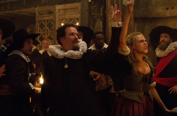
In the Amsterdam of 1636, animated by the cult of money and that of beauty, among the shops of the most extraordinary traders and painters, speculators pushed the price of tulip bulbs to the stars. It seems easy to get rich without fatigue, and the city palpitates with new and attractive possibilities. Cornelis Sandvoort (Christoph Waltz), a rich and mature merchant, decides to commission the portrait of his bride, the beautiful Sophia (Alicia Vikander), to a promising painter with an extraordinary talent, Jan van Loos (Dane DeHaan). It is a fatal encounter, marked by an overwhelming sensuality but also by the thousand dangers that the two lovers will have to face in the overheated atmosphere of a financial euphoria on the verge of madness.
In Bruges
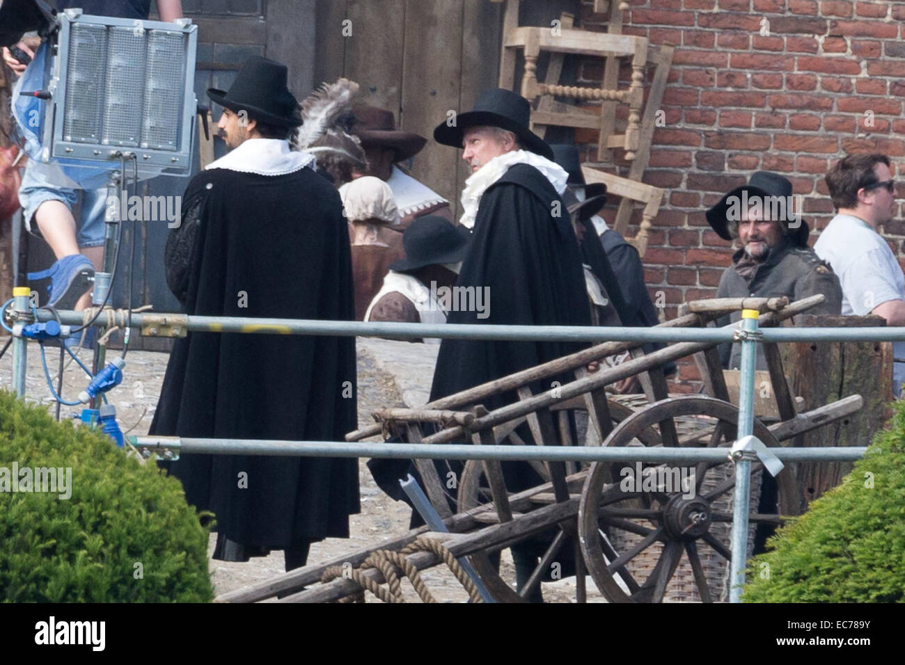
production design by BAFTA winner Simon Elliott, and luscious, period perfect clothing from Oscar winning costume designer Michael O'Connor
painted furniture, the abbey and market place, the townspeople crowding the docks and canals, the neck ruffles and luscious fabrics worn by the well-to-do, the quirky headgear and cape worn by Maria.
In July 2013, it was reported that director Justin Chadwick, the man behind The Other Boleyn Girland Mandela: Long Walk to Freedom, would helm the adaptation of Deborah Moggach’s bestselling novel Tulip Fever, which had been in the works for around a decade by that point. The project seemed like another attempt at Oscar glory from its distributor The Weinstein Company, with all the markings of success: A two-time Oscar winner in the villain role (Christoph Waltz); a rising star from Sweden in the lead who was destined for greatness (Alicia Vikander); a script by legendary playwright Tom Stoppard; and a supporting ensemble of plummy British greats united under a story of passion amidst the tulip mania of 17th century Holland. What could possibly go wrong?
2015 Cannes Film Festival, responses weren’t glowing but it was still early days, and by that point in time, Vikander was well on her way to Oscar glory, which would surely help sell the film.
Now to getting it made into a film. Steven Spielberg had also bid on it and for years and years tried to make it but unfortunately couldn’t. Eventually my team at Miramax got together with his team at DreamWorks and made it a joint venture. We had a brilliant screenplay from Tom Stoppard, a great cast in Jude Law, Keira Knightley, and John Madden directing hot off his triumph with Shakespeare In Love. Which just goes to show — even after all those alleged battles between Miramax and DreamWorks, here we were, reunited with the director of Shakespeare In Love and the producer of Saving Private Ryan, making a movie together. Everything was going swimmingly, sets were being built, everyone was excited, and then BAM!, the British government changed the tax law, and a movie that started with a $30 million budget doubled to $60 million and we had to close it down. But we were determined to make it. So along comes the director Justin Chadwick with this incredible cast of Alicia Vikander, Christoph Waltz, Judi Dench, Dane DeHaan, Cara Delevingne, Matthew Morrison, Jack O’Connell, Holliday Grainger and Zack Galifanakis. Working on a much lower budget, we created 1634 Amsterdam in an English boarding school in Norfolk, a Herculean feat of production design. When you see the film, beautifully shot by Eigil Bryld, expert production design by Simon Elliot, equally great costume design by Michael O’Connor, it’s a spectacle. But it took longer than it should have to get it all done and in our business that means, “Uh-oh! Something must be wrong with it.”
s a $48 million DreamWorks production in 2004, directed by John Madden (Shakespeare in Love) and starring Jude Law, Keira Knightley (or perhaps Natalie Portman), and Jim Broadbent. The film was in active pre-production, with sets built and some 12,000 tulips planted, when the U.K. government closed a tax loophole and the financing collapsed. Those 12,000 bulbs, Moggach said, were given to her friends and neighbors in London, sprouting everywhere as a reminder of a film that never was.
Moggach isn’t some Hollywood neophyte: She wrote the screenplay for the 2005 Pride and Prejudice and saw her novel These Foolish Things adapted into the film The Best Exotic Marigold Hotel. So there remained interest in Tulip Fever, which was finally resurrected as a film by the mega-producer Harvey Weinstein. Though its budget was lower, at $25 million, Weinstein still assembled a big cast and hired Stoppard to work on the script; many more tulips were planted, and the film was finally committed to celluloid in 2014. That, usually, would have been the end of that.
Cressida Bonas in the movie Tulip Fe prince harry
How did you begin to dream up costumes that captured 17th-century Amsterdam?
“You start by meeting with the production designer and looking at images. The great thing is that this is the Golden Age in Amsterdam, with all the great painters like Frans Hals and Anthony van Dyck. There were thousands of painters painting there, so there is a massive amount of material. We found lots of references and put them on mood boards. Then I sketched something up.”
How did you go about developing Alicia Vikander’s character, Sophia, throughout the film?
“The idea for Sophia was strong looks done in typical Dutch fashion when she goes to be Cornelis’ wife because he and his family are dressing her. As the affair progresses, the clothes become more revealing: her collars and caps start going, and her dresses become less strict and robust. At the end, she’s in a bodice with a simple, more demure costume.”
What were some key elements in the costumes for Christoph Waltz’s character, Cornelis?
“Cornelis and Sophia are rich Protestant merchants. That meant including the colour black and big ruffs. You’d think he was wearing plain black, but it was black silks with textures, and often the fabric was even cut through to show pink lining underneath. There was a class to the fabric, because to dye a fabric black [in those days] showed a sign of wealth. It was a difficult three-step process. For the ruffs, I met with some old colleagues of mine from The School of Historical Dress who were doing classes on ruff making. Ruffs were a huge industry in Amsterdam, keeping them clean and making them stiff involved multiple steps, so you paid people to do it. People were displaying their wealth by wearing them around their necks.”
What types of colours and patterns did you concentrate on and why?
“There’s a scene where Cornelis and Sophia are together wearing these linen nightshirts with tulip embroidery. It was important to do because that was a form of embroidery people used on their linens called blackwork. If you look closely at old portraits, you’ll see linen creeping out from a dress or a doublet with this specific embroidery. I was also interested in pinks and oranges. They seemed to compliment all the black quite well.”
How many costumes did you have to make?
“I never count, but I’m sure we probably made around 50 principal character costumes, 25 nun costumes, and 35 orphan girls. And there would have been probably 500 extras costumes that were hired. We had two-and-half months before we started shooting, and continued to make costumes while filming.”
Tell us about your team.
“I had a couple assistants, a costume supervisor, and a team of 20 to 25 costume dressers. There was a workroom with a cutter who cuts all the patterns, and under her were 8 people. Then there were costume houses that were making things under my designs, and also outworkers around the world making linens for the ruffs, collars, and cuffs. I worked with a dealer in Turkey who supplied a lot of the material for the clothes and jewellery, and shoemakers in Italy. We also hired extras costumes from Spain and Italy. Every day there was a big crowd.”
Michael O’Connor behind the scenes with actor David Harewood.
How does working on a period film differ from working on a contemporary production?
“A lot of work and detail go into historical work. You have to manufacture everything from the colour of the thread to the size of buttonholes, hooks, and bars. You’re constantly feeling the weights of fabrics to see if they’re right for the draping. They’re very time consuming and expensive. In modern films, sometimes the answers are right in a shop.”
What’s it’s like for you to go sit in a theatre and watch a film you’ve worked so hard on?
“You always try for 100 percent, so it’s quite difficult and personal. You’re critical of your own work and think, “Maybe that could have been longer or shorter or less this or less that.” On the whole, it’s exciting, and the rest of the team is genuinely like, “Wow, amazing!” For Tulip Fever, Deborah Moggach was in the film as an extra, and it was great having her look at the costumes and hear her say, “They look wonderful!” I was really pleased about that.”
Do you have any favourite looks from the film?
“I liked doing Holliday Grainger and Jack O’Connell’s characters’ clothes. But my favourite things were the ruffs. They were such a beautiful learning process. We’d send them to the starch room to decide their shape, and they’d come back stiff like a cake. And wearing them, you felt like you were in that time. Doing historical things is part of the pleasure—you’re reliving history a little.”
TAGS: COSTUME DESIGNER, FEATURED, MICHAEL O’CONNOR, TULIP FEVER
2017Oasis (TV Movie)
2016The Tale of Thomas Burberry (Short)
2015Muhammad: The Messenger of God
2014Suite Française
2012Dredd
2011Jane Eyre
2011The Eagle
2009The Continuing and Lamentable Saga of the Suicide Brothers (Short)
2008The Duchess
2008Miss Pettigrew Lives for a Day
2007Brick Lane
2005Wallis & Edward (TV Movie)
2005Tom Brown's Schooldays (TV Movie)
1998A Secret Audience (Short)
1998The Star (TV Short)CCCCCCCCCCCCC
Bill Crutcher
...
supervising art director
Producer Alison Owen read the book Tulip Fever before it was even published and instantly bought the option.
Within forty-eight hours of buying the option and sending it out, Owen had offers from Stephen Spielberg, Ridley Scott and Harvey Weinstein. Due to a series of obstacles, however, Owen took another fifteen years finally to go into production on the film, which she now sees as a positive setback: 'I was devastated when the film fell through the first time, because I'd felt that it was very much of the zeitgeist. Little did I know that it was actually becoming more and more zeitgeisty, if that's possible! The recession that we were experiencing when I first optioned this book was only the start of a bunch of financial consequences that we've been suffering globally ever since. If anything, it's a lot more relevant now then it was then."
Fifteen years later, her tenacity and vision finally paid off and in May 2014 the film went into production.
From Book to Script to Screen
For Alison Owen, Deborah Moggach's novel was a fascinating read: 'It's got so many layers it's hard to condense them, but that's the challenge, trying to fit everything into the script. It's a fantastic love story set against this amazing backdrop, and at the heart of it, it's a metaphor about love, lust and passion.
The most highly valued tulips were the ones that broke into colors and stripes and were called breakers. At the time, they had no idea why that happened, but in actuality it was because of a virus. Ironically, the most valuable bulbs were the ones that were diseased, carrying the seeds of their own destruction, ultimately rotting. Of course that's a wonderful metaphor for the adulterous love that takes place in the novel. It is this wonderful love, this great passion, but because it's an elicit love, it also carries the seeds of its own destruction."
'It was the first stock market crash; the first time that people got really obsessed with buying things that weren't technically worth anything, giving them extreme value to the point that they became completely invaluable."
Alison Owen and Director Justin Chadwick previously collaborated on his first feature film, -The Other Boleyn Girl'. He explains that whilst shooting -Mandela: Long Walk to Freedom' in South Africa, his Producer Harvey Weinstein had shown him the script and he loved it, saying: 'I loved the ride of it. I went back to the book, I love the book too. It's a real page turner, and I defy anybody to pick up that book and not read it in one sitting."
He continues: 'I wasn't particularly looking to go back and do a period movie, as I wanted to make something that was modern, but this felt completely modern and I could approach it in a way that was contemporary and visceral.
It was at a time when working class and middle-class traders could actually have vast wealth. They'd just newly discovered that the world was round. Ships were going around the world bringing cargo in from all over and they were questioning the presence of God and what that meant to them. There wasn't the class system that there is, or was, in this country. It was a really intoxicating time, where money was sloshing around."
The Characters
Sophia Sandvoort
Adds Producer Alison Owen: 'I was always vehement about Sophi being very young because the plan itself is a bit crackpot, the product of a young girl's imagination. If it was an older woman that dreamt it, you would either think she was a bit stupid, or that it was too Machiavellian. It was essential to have the exuberance and the simplicity and innocence of a young girl who would really believe she was doing a good thing for everybody." She continues: 'It's a tough one, you want to catch somebody who is just on the rise and Alicia is breaking through to great things. She's an extraordinary actress."
For Dane DeHaan, Vikander has the ability to bewitch, as he describes the moment that Jan meets Sophia for the first time: 'When Sophia walks down the stairs Jan is taken from the start by her beauty. He's very curious as to how she got herself in the position of being married to the older man. He has so many questions, but ultimately he's blown away by her beauty." He continues: 'De Bye [Kevin McKidd] is a very rich collector that Jan hopes to sell a painting to, but he tells Jan that his work is lacking obsession. Jan is really happy to drink a beer all day long and paint for as long as he can get by. When Sophia walks down the stairs, his obsession with her begins and he learns what it means to be obsessed. Sophia becomes the object of all of his paintings and he can't stop thinking about her, which fuels the passion and the love that he has for her and his need just to be with her."
Before he met Vikander, DeHaan watched some of her films and was immediately thrilled at the prospect of working with her: 'I watched -A Royal Affair' and it's just unbelievable how good she is. She's speaking all these different languages, but she is still so captivating and internally complex. She really is such a brilliant actress, that I was excited to work with her and discover who she was."
Vikander explains how important it was for her that she sat for the portrait of Sophia that was used in the film: 'I actually sat for a painter to make the portrait in the film and it is quite intense. In my job I look into people's eyes that I don't know that well, but when a painter looked at me, I got a bit scared because he was really trying to figure out who I am. The relationship between the painter and the person that gets painted is quite intense and I definitely brought that to the scenes with Dane. It really helped both of us to have that context to Jan painting Sophia. I think it really brought out the passion."
Jan Van Loos
Chadwick was also thrilled with the casting of Dane DeHaan: 'I'd seen Dane in independent movies, and loved the way he had an edge to him, and a romance to him. He hadn't played a leading man before, which was exciting for me, and to him. I thought there was something about Dane that could just capture that spirit and sensitivity of the artist, but also the danger for a man who was prepared to go to any length for somebody he loves, and the passion that he needed." Adds Alison Owen: 'Dane is so charismatic. When the camera's on him and he smiles, it feels like the sun's come out and you don't want to look anywhere else. He even pulls off the feat of looking very European and fits into the period very well with real grace and elegance." She continues: 'You really believe him as an artist, you can see he's interested and has that kind of mentality. The paintings were such a feature of this, that they had to be good and Dane had to feel realistic and credible as a painter."
DeHaan describes why Jan was an interesting character for him to play: 'Jan is very much a true hero. He's untroubled, just a hero that goes wholeheartedly at something in the name of love. I haven't really played a hero like that before."
Playing an artist convincingly was always going to be difficult and yet was an essential component for DeHaan to master in his need to make the experience as real as possible. To that end, he spent some time learning how to paint under the tutelage of artist Jamie Routley, whose portraits have been exhibited, amongst other places, at the National Portrait Gallery in the BP Portrait Award Exhibition and is the artist who painted the portraits used in the film. Explains DeHaan: 'I'm not a painter, and going into this I'd have given myself a third grade drawing level. Then I met Jamie, who trained in Florence in the seventeenth century style. He makes his own paints and paints as Jan would paint. Jamie was an amazing, invaluable resource because he gave me painting lessons and taught me how to make it look real."
He continues: 'A lot of times in movies, you see this really stereotypical movie version of a painter just standing in front of the painting at his easel. But that's not really how it was done. It was about stepping back and taking it in.
Everything you see in the movie is authentic to how these Dutch painters were probably painting. It was important for me to get that right and to get it accurately. I think I may be high school level at this point in my painting."
 For Alicia Vikander, it was a pleasure to perform opposite DeHaan: 'He has such intensity to him, and he's a brilliant actor so I was very excited and happy when I knew we were going to do this together. That intensity that I'd seen before, he is really bringing to the character of Jan as well – and that is very sexy."
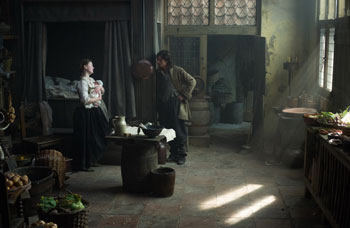 Maria and Willem
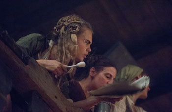 Dench describes her character thus: 'The Abbess grows a lot of tulips and knows everything about the bulbs, from the sizes and how to weigh them to the price of them. She enables the story to go ahead. She gets her hands dirty and is very hard working. They're all proper working nuns. She doesn't stand on ceremony, she's quite rude, and she smokes a pipe."
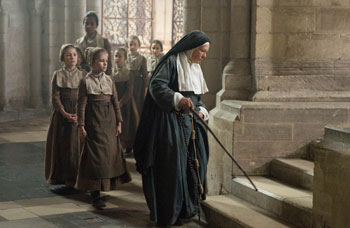 Tulip Mania
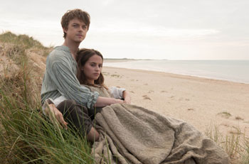 Research
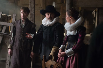 The Look of the Film
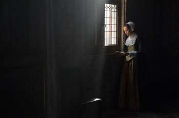 Locations


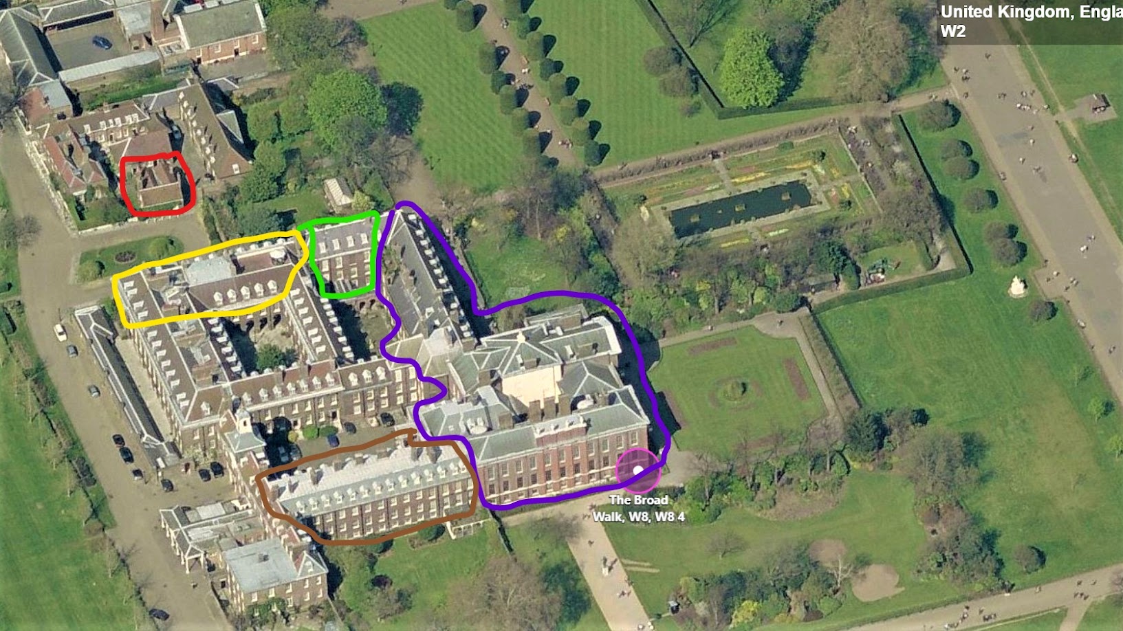
KENSINGTON PALACE
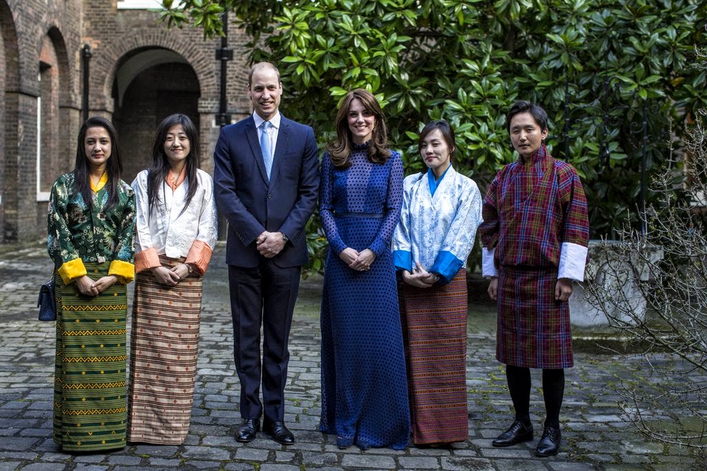
While I was writing the story about Prince Harry and Meghan’s engagement, I came upon some photos of Kensington Palace, where “The Trio” both live and work. “The Trio” are what William, Kate, and Harry are affectionately known as at Kensington Palace. Now, of course, that nickname will have to change since Harry is marrying, except “The Quad” doesn’t have quite the same ring as “The Trio.”
One of Harry & Meghan’s Official Engagement Photos
The Trio share offices at the old apartment at Kensington Palace, where William & Harry grew up, mostly with Diana, and also, earlier with Charles. Diana and Charles lived in two combined apartments in Kensington Palace, #8 and #9. Originally they had just one apartment, which proved too small for children, staff and security.
Princess Diana wearing emeralds that were loaned to her for life – from the Queen.
After Diana passed away, the royals took a year to clear out her apartment, stripping away all traces of the Princess. Furniture and personal items were given to family and friends, some were put in storage. Other valuable items such as paintings and antiques on loan from the Royal Trust were given back. Her jewelry which was on loan for her lifetime by the Queen, was also all returned.
The apartments stood empty for years until Prince Charles used them as offices, including letting his Royal Drawing School use the apartment for studio space. Later, when William and Kate lived in Nottingham Cottage, they would see nude models in the windows – posing for drawing lessons!!! The Royal Drawing School was later moved to another location and the #8 & 9 offices were remodeled for William and Harry’s charities and royal duties. The larger apartment of #8 & 9 was turned into their office space and reception rooms while the second smaller apartment was rented to a member of the royal staff as his personal home.
When writing Harry’s engagement story – I realized that I actually recognized many of the these newly renovated offices as the old, happy rooms where Diana and her two boys had lived. A few days after she died, her butler and close friend Paul Burrell took photographs of her apartment and those pictures are invaluable today to remember how Diana had lived at Kensington Palace.
It must be very strange for the boys to return to their old family house, even though it has been remodeled, it is still the same house.
I think it’s a fascinating story of royalty and renovation!!
Enjoy!
I love this rare photo of Diana outside her apartment, with Nottingham Cottage behind her. She is holding hands with a visitor in a wheelchair who was there for the International Spinal Research Trust of which Diana was a patron.
There are not that many photos of the façade of the apartment where Diana and her boys lived and later, where her boys’ charity offices are today. Here is the front door to Apartment 8 & 9, the combined two apartments were Diana lived. There was the first floor for staff and security, then the main floor which was on the second level, and on the third/attic level was the nursery and more staff rooms. Their neighbors to the left were Prince and Princess Michael who still live there today. And further on, is a locked door that leads to the main, original Palace which is open to the public. Early in the morning, Diana used to put on her rollerblades (remember those?) and go through that locked door to skate around the public parklands – shocking those who were lucky enough to recognize her.
A rare photo of Diana and a friend. Her house is on the right, along with Princess Michael’s. Behind Diana is a secret garden, completely hidden behind the ivy. The garden is actually assigned to Princess Michael’s apartment – but Diana was given sole use of the secret garden while she was alive.
After Diana passed away a poignant story was revealed: her best friend had tragically given birth to a stillborn baby and Diana insisted that the baby be buried in the secret garden, insuring that her friend could privately visit the grave whenever she wanted.
And, to the very left of Diana, not in the photo, is Nottingham Cottage, where Prince Harry and Meghan live now. Their windows look out on the windows of Harry’s childhood home.
Kensington Palace by Color: Purple are the original state rooms – open to the public. Queen Victoria was actually born there. Brown: William & Kate’s 21 room apartment #1A. Green: Prince & Princess Michael #10. Yellow: Princess Diana #8&9. Red: Nottingham Cottage.
A closer view:
When William, Kate and Harry took over Apt. #8&9 for their offices, they moved the front door to the back door. Instead of having streams of people wandering around the private apartments – the route to enter the offices was changed to what was once Diana’s back service door. Today, visitors to the Princes’ offices now begin their trip at the public state rooms – where the red arrow starts. They walk through the courtyard behind Princess Michael’s apartment through an adjoining door into Princess Diana’s courtyard. There, under the archway – they enter the door to the Princes’ offices – the door that was once the back service door to Diana’s apartment. To facilitate this movement of visitors – an overhang was built in Princess Michael’s courtyard so that the guests were not exposed to the elements.
An Even Closer View:
A close up photo of Diana’s apt on the right and Princess Michael’s next to it. NOW – notice on the roof of Diana’s apartment in the red circle – an umbrella!! The family used the roof as a sunny garden spot and a place to picnic!!!! I had never noticed the roof garden before!! Now - Notice across the street from Princesses Diana’s and Michael’s – the secret garden. Princess Michael uses the secret garden exclusively now – she put in a long pond in the center of the lawn and restored the loggia. And finally – across from Diana’s front door is the tiny Nottingham Cottage or NottCott as it is called, where Harry & Meghan live.
Diana’s #8 & 9: The front door enters a lobby with an interior door that blocks cold, windy air from entering the interior of the house.
The section of the palace where Diana’s apartment is was built by King George I for his mistress, the Duchess of Kendal. That’s the beautiful couple, above!!! As my Aunt Janice always said – “there’s someone for everyone!!”
Seriously though – portraits were notorious for making people look so much prettier than they truly were. Poor Duchess of Kendal!
During WWII the apartment was bombed and it was left empty until it was restored in 1981 for Charles & Diana.
And yes, they did decorate for Christmas as seen here. Above the black door are the traditional gas lamps seen at Kensington Palace.
Here Diana and her lady-in-waiting at the front door. Behind you can see there is an arched wall and mirrors.
Terrible photo!!!! The entry leads to a barrel ceiling hall. Portieres are in the lobby.
The barrel ceiling entry leads to a large lobby with a skirted table, desk, and bench. The guest cloak room is seen through the door. After the divorce and before she died – Diana and her original decorator Dudley Poplak freshened up the apartment. It was once all peach and pink and creams until it was upgraded to daffodil yellow, golds, and creams. The green and peach rug was replaced with this newer beige version. The new updated decor was never finished. Diana saw some refurbished rooms only once before she died.
The view across the lobby – leads to the central stairs. These go up from the basement to second floor. Another lobby leads to a second stairway that goes up to the attic level. At that lobby, there was a elevator hidden behind a bookcase/false door.
The stairs lead up to Diana’s sitting room and Drawing room – off to the right. Straight off the landing is the TV room or Charles’ former sitting room. To the left is the elevator and stairs to the attic level. Notice the molding on the walls.
Diana’s portrait. She expected this would one day hang in Buckingham Palace. Instead, it is now at Althorp, her family’s estate.
Now, I will show you how different her apartment looks today! I have researched this extensively – to the best of my ability. I could be wrong about certain details (which will KILL me if I am!!! LOL) But, this is the best I could do without touring the private offices myself.
Today, Diana’s former apartment is used for receptions and meetings and offices. Large groups of people come and mingle and then either William, Harry, Kate or all three, are ushered in. The royals talk with the guests and then take a few photos. Other times, they have longer meetings, more serious events – around a large dining table which is moved from room to room as needed.
And as shown before - here is the route visitors now take to the Princes’ offices. Guests first enter the original palace, go through the side door to the first courtyard behind Princess Michael’s apartment, then they go through a door to the second courtyard to the back door of the Diana’s old apartment. Recently, an overhang was built in the first courtyard to protect guests from the elements.
After each event or reception, the guests are taken out to the courtyard (probably on the way to leaving!) and a photo is taken with the Royals. If the weather is bad, the photo is taken inside. These courtyards need to be landscaped. They are rather stark, except for this one lone magnolia tree. There is an old wishing well, too.
A photo in the courtyard with a team of athletes that came to visit. Surrounding the courtyard are other apartments, smaller ones – that are given to important members of the staff to live in – called a “Grace and Favor” apartment.
Here The Duke of Cambridge and the Duchess leave the back door of the apartment, then they walk across the courtyard to their own apartment – over the next courtyard.
After this reception was over and photos were taken in the courtyard, the couple walked across to the other side to reach their own private apartment, located in yet another courtyard.
The double doors at the end of this arched walkway leads to the first courtyard behind Princess Michael’s apartment and then onto the palace parklands. The back door to Diana’s apartment is to the left of these double doors.
Here Prince Harry and Robin Roberts pose in front of the double doors before entering the back door to the offices for their television interview.
And here, the two Princes walk into the back door, which is now considered the front door, to the ground floor lobby – greeting their guests, including the actress Rita Ora.
Before, when Diana lived here, this was the back door – where the butler would work and tradespeople would come. An extra refrigerator was stored here, along with a mail cubbyhole station.
And here is the stairway. It has been lightened – the bannister is a lighter stain, as are the floorboards. The walls are now a soft celadon.
Here, an agreement is signed in the stair lobby. Remember this stairway?
Under Diana’s ownership – the walls were daffodil yellow with bright white trim.
When the apartment was bombed during WWII – this staircase was damaged and all the beautiful trim had to be restored.
Today, the walls are a soothing celadon and the trim is cream, not bright white. There are new crystal sconces.
And another view – of the newly polished floorboards – where there used to be wall to wall carpet. From this landing, you can enter most of the reception rooms in the house. The open door leads to what was once Diana’s blue and pink sitting room.
At the front façade of the apartment, are a row of windows. On this enfilade are Diana’s former sitting room, the drawing room, and then the dining room. Off the dining room was a butler’s pantry. The drawing room has three windows, while the other rooms have two each. The pantry had one window overlooking the front façade.
The Drawing Room is at the center of the two front rooms. Along one wall was a large original tapestry, an antique settee sat in front of it. The room is so large, the piano looks dwarfed. Across the room flanking the fireplace are two green sofas.

The walls are upholstered in silk, not wallpapered and it was deemed too expensive to change this in the redecoration. The painting above the fireplace is different here – this must be something that Charles got in the divorce. He requested several paintings and a few pieces of antique furniture. Diana said “no” to him asking for a series of watercolors of their sons’ christenings and their wedding. Interesting.
You can see how beautiful the silk shades were. This door leads to her siting room.
I love this antique settee. I wonder what happened to it? Most likely either Charles took it or it was returned to the Trust. The tapestry is another mystery. Notice the gilt consoles that flank the settee - you will see those again later!
A rare photo of the back wall with a French antique desk, chair, and a gorgeous painting – which is no longer there.
Charles must have wanted this Italian painting, also. Not that I blame him!
Later, in a terrible photo taken from a documentary – you can see the Italian painting is gone, replaced with this one. Hmmm…
After her divorce, Diana told author Ingrid Seward she was not allowed to sell anything – antiques or jewelry.
Darling. This piano will be seen again….
In this photo – you can clearly see the ribbon trim that lined the silk fabric wallcovering.
The Drawing Room is between the two other main rooms of Apt. #8&9: the Dining Room and Diana’s Sitting Room:
The Dining Room was painted red at a later date. It always looked like it needed an update to me. The table cloth was terrible and the rug was so dated. I’m sure in the 80s and 90s – it was pretty.
The open door leads into the Butler’s Pantry where butler Paul Burrell would work. In his book, he said that he would sit in his pantry and through the enfilade – he could see three rooms down to the other side of the house where Diana would be in her sitting room, at her desk, working.
Another view - this open door leads into the Drawing Room.
A much earlier photo shows the room as it should be – with beautiful cream walls. So much prettier!!! I love that painting. The windows overlook the cottages, including Nottingham Cottage. Not sure why or when the walls were painted red, but the difference between the two wall colors is amazing.
Today:
Are either of these two rooms, the Dining Room and the Drawing Room, used today as offices? I can’t find any photos of these two rooms used for either receptions or meetings, even though it is reported that the Drawing Room is.
Perhaps the Drawing Room will be used only for large, dressy affairs and as of now, that hasn’t occurred. Or perhaps, these two rooms will not be used by the Princes.
The only photo I could find of the Drawing Room used after Diana lived here was when the Prince’s Royal Drawing School used the rooms at Apt. 8 & 9 for studio and gallery space, as seen above. This photo came from an old brochure for the Royal Drawing School. You can see most of all the furniture was removed but the rug remained and a set of sconces were added around the room.
I’ll bet that they would have gotten a rash of students if they only knew they would be painting in Diana’s famous apartment!
So if the Dining Room and Drawing Room are not being used by the Princes, what rooms ARE being used?
First, there is the Princess’s Sitting Room, which is off the Drawing Room. This room was used by Diana as her personal office and library and sitting room. It was redecorated right before her death and she saw this room redone – only one time. The pink sofas were recovered in cream and an antique bench was added instead of a coffee table. The curtains were also updated. But, since the walls were upholstered, not wallpapered, they were left as is.
This view shows the newly recovered sofa, in cream, and the new bench bought. Her desk was moved from the window to the back wall.
Before – the sofas were pink. Later they were recovered in pink stripes. Behind the sofa was a large bookcase and later, a bar cart. This was taken before there was a dhurri rug. I always loved this decor! The bullseye antique mirror disappeared some time later – right before she passed away.
Before – an early view of the blue curtains which were exchanged for more tailored blue curtains.
And here is the sitting room today. It is one of the more frequently used reception rooms by the Princes’ charitiesssssssssssssssssss
Today: The door opens off the stair landing. The carpet was removed and dark hardwoods underneath were polished and an area rug was added. The fabric on the walls was removed and they were painted a soft gray with a deeper gray on the wainscot.
An antique mirror was placed above the beautiful white marble mantel, which was left untouched. To the right is a console and two lamps with fabric shades.
I don’t understand why the landing floorboards were stained a light tone but the floors in the other rooms were stained dark?
This view shows the large oil painting that hangs above the console with the two lamps.
The beautiful crown molding looks much more vibrant today without the busy fabric on the walls. And without all the sitting room furniture – a large number of people can fit inside what is really a large room. Along the side wall on the left is an extra large oil painting. Before – Diana kept one of her tall bookcases on this wall.
For some meetings if needed, a conference table is set up in the middle of the old “sitting room:”
The door to the right of the console with the lamps leads into Diana’s Drawing Room.
In this photo – you can see an Oriental rug was placed down on the dark floorboards. So much prettier than the wall to wall carpet.
On the back wall – there is a large oil painting flanked by two sconces. You can see the brass railings that were placed around the room to hang paintings from so that the walls remain pristine – without nail holes.
Here is a larger view of the painting which is so interesting. On this day, Kate was an guest editor of the Huffington Post!
Hard to believe this was once Diana’s pink and blue sitting room!
Here is a view of the conference table and the console table. The two windows in this room run along the front of Apt. 8 & 9. I love the painting of the soldier on the horse.
We know that Diana had a Sitting Room, did Charles?
Yes, Charles had his own sitting room, which was located behind Diana’s sitting room and along the back side of the Drawing Room. The windows in Charles’ sitting room overlook the internal courtyard – not the front of the apartment as the three main rooms do. I’m sure this room was darker because of this. After the divorce, the room became William and Harry’s TV room. So that the boys would feel secure, Diana kept all his furniture as it was – green sofa, two red checked chairs, a library table and dhurri rug, along with two lime green lamps. Of course, the room was a mess – it was used by two teenaged boys!!! And as always, the room had terrible wall to wall carpet. Notice that the marble mantel is a much darker variety than found in the Drawing Room and Diana’s own Sitting Room.
The room differed from Diana’s in that the wall trim was much more pronounced here. The walls themselves had trim placed on them – acting as frames.
If the room looks familiar – you might remember it was here that the famous documentary with Martin Bashir was filmed. “There were three in the marriage….” was the most famous quote from that documentary.
The room was tidied up a bit for the filming – and the two green antique chairs used in the Drawing Room and Sitting Room were borrowed for the documentary.
And Today:
Here is Charles’ Sitting Room today! The terrible wall to wall carpet was removed and the beautiful floorboards were polished and stained dark. An Oriental rug was laid over the newly refinished floor. The walls were painted a soft and dark taupe. The wall trim is painted the same color as the walls. New traditional brass sconces provide light.
This was an exciting find!!! An artist from the Royal Drawing School painted Charles’ Sitting Room when he was studying in the studio. He really captured the beauty of the empty room, including the mystery of the adjoining library.
A close up of the dark marble mantel.
I wish we had photos of the rooms without all the people in it!! But here, you can see the paneled doors with beautiful architrave – flanking a gilt painting framed by the wall trim.
Another wall shows a smaller painting also framed by the wall molding.
The Princes have access to the Royal Collection Trust – and all the paintings they could ever want. Since William will one day be KING – he is probably allowed to borrow whatever he wants for his offices and homes.
The two former Sitting Rooms are larger rooms – when a table is needed, either room can be used. Here, Kate holds a meeting in Charles’ Sitting Room.
And it was in Charles’ sitting room that this interview took place, with the lamps borrowed from Diana’s sitting room!
The next reception room is not one ever seen before – but it’s on the ground floor, with the windows that overlook the front of Apt. #8&9
The room is on the ground floor, so the ceilings are lower and the windows are smaller. Plus the mantel is very simple. The floor is carpeted and the walls have a block trim paneling, painted in two tones of taupe.
The room has had a variety of furnishings during the past years that the room has been used by the Princes. But, recently it was properly furnished, by a designer. Who? We don’t know!! Originally, they used these two beige chairs, a green sofa that was in Charles Sitting Room, a green coffee table and this brownish rug.
One piece of furniture, seen at the far left, looks like it was from Linley, made by Princess Margaret’s son Lord David Linley – who is also William’s cousin. Perhaps it was a wedding present?
Today: The new decor has a peach tufted ottoman/coffee table and two taupe covered antique sofas. The pillow fabric is repeated in a skirted table, not seen here.
At least they got rid of that brown rug!
There’s also an antique cabinet and a selection of old oil paintings.
There are now two newly covered pink chairs with green pillows. You can see the skirted table at the far left.
The new decor is such an improvement over the old decor mishmash. Very English – it reminds me of William & Kate’s apartment, just not nearly as fancy.
The old decor – but you can see the two windows that overlook Nottingham Cottage – out the front side of the apartment.
The old decor with Charles’ old green sofa and the Linley desk.
And the engagement video took place in that same reception room – with the windows that look out over their own cottage.
And…at another apartment in Kensington Palace….
Before the Obamas left office, they paid a state visit to London where the Cambridges welcomed them to their just recently renovated apartment, #1a – albeit a 21+ room apartment!!
It was the very first glimpse into their new decor and it remains one of the few times the camera has been invited inside.
The former Drawing Room was once a vivid blue when Princess Margaret lived here. Today it is a soothing cream, along with the flat carpet underneath. Layered on top is a muted area rug.
I’m totally in love with this apartment and would move in, bringing only my toothbrush, if that. But I might have to change out the wall to wall carpet!! I adore the antique French gilt chairs in a blue and white fabric. The oil paintings are beautiful and I love the mix of the subtle contemporary touches with the old.
The decor is perfect for the young Royals – a mix of the old and the new. The bank of windows over looks their private garden. Notice that gilt console?
Does it look familiar?
And to the left of the sofa – is the second matching gilt console. Those came from Diana’s Drawing Room!! I think the piano also came from Diana’s apartment.
Those are just the two things that I noticed, but I wonder how much else was originally Diana’s? These sofas? Any of the lamps? The chairs?
Actually the more I look at these sofas, I think they WERE Diana’s!!

The only difference I can see is the channeling on the back of the sofas – but that could be done when reupholstering them.
And here is the Drawing Room – with the gilt consoles, one of a pair, now at the Cambridge’s apartment, along with Diana’s piano. I wonder where the tapestry and the settee went to??? Are these chairs the new pink ones in the Princes offices – on the ground floor? Do you see anything else passed down?
Years ago, Princess Margaret and her then husband Lord Snowden posed for this photo in the garden in front of their apartment #1a at Kensington Palace. A brick wall protects the apartment from visitors, but people could still enter the private garden. Recently the palace added over 800 ft. of bushes and gates to create more privacy for William and Kate and other residences living in Kensington Palace.
The Cambridges took a family photo that reminds me so much of the one above that Princess Margaret and her family took. You can see there is some additional fencing added to the top of the brick wall.
Over 800’ of bushes were planted to hide the Cambridge family from the eyes of tourists. There were already new gates put in, but people could still see into parts of their property. The couple had been living in Anmer Hall, their far away country home, full time. But now, with George in school, and with William taking on more royal duties, their main home base is now at Kensington Palace.
AND finally….you may have seen this. The house where Prince Harry’s intended Meghan Markel lived in in Toronto was recently put up for sale.
We had seen photos of the house on Meghan’s Instagram, but she didn’t actually own the house. It was owned by a friend of hers – a fashion designer that currently lives in NYC. Meghan rented the house from her friend and it was said that her TV show SUITS paid the rent. Must be nice!! It must have been quite a steep price because the asking price for it is so high – close to $1,500,000.
The house is located in a trendy area of Toronto called Seaton Village.
The back yard is actually large for a house that is only 40’ wide. It has a deck that needs to be stained. This area could be a knock-out with proper garden design.
BEFORE: Meghan is a very talented photographer! She made her backyard look like a gorgeous oasis.
The house was cleared out and painted – new curtains were hung, and then new furnishings from a stager were moved in.
The house is just 40’ wide so the living room is tiny. I love how they furnished it – for a younger, hip couple, not some couple that could be Royal. What? Wait!! She WILL be Royal!!!!
This decor is quite a different look than what the Cambridges have at Kensington Plaza.
The big question is – which decor will Harry and Meghan prefer – this or that????
BEFORE: Across from the living room in the foyer – Meghan had an organic wood console where she placed flowers, bought weekly.
BEFORE: I love the way Meghan decorated her foyer with this console and flowers. While this looks great with her decor, it doesn’t look good with the stylists new decor. Her organic look doesn’t mix with their gray monotone contemporary look.
And the view to the back of the townhouse with the white staircase – with the one black accent wall.
BEFORE: Meghan used much more color than the stylists did. The red striped rug was a bright accent at the foyer.
Today: Above the sofa is a large modern piece of art.
BEFORE: Meghan has a slipcovered section covered with Turkish throws.
BEFORE: Rather than one large painting, Meghan had several smaller prints. In such a small space – I think I like the one larger painting – it looks more dramatic.
AFTER: The floors have been restained and look beautiful, don’t they? The table is going the correct direction – lengthwise, Meghan had it wrong. Love the big art work – it reminds me of one by William McClure, no? They kept the black wall that was there when Meghan lived here but put in new curtains and a new light fixture, which I don’t like as much as Meghan’s. And I much prefer Meghan’s marble tulip table to this one. Through the door you can see the kitchen with the built in bar and bar stools.
Before: Meghan’s black wall was highlighted by her large antique gilt and cream painted mirror.
Her table should have been turned the other way – but I like her table so much! Not the rug though – too chunky here! Her light fixture is nicer.
The kitchen – love the bar and light fixture. Again, this is for a young, hip couple that likes modern. Me? I have more of a Royal Taste. LOL!!!!
The guest room is small, with cute styling. Except – the mirror should be hung the other way!!
BEFORE: This is how Meghan styled her guest room. Just as cute.
The master is all gray with a large bay window. The decor fits in well with the living room and dining room. Very well done!!
Before: Meghan had a brown linen headboard and as always, lot of flowers. Truthfully – I think Meghan’s style is more in tune with life in the English countryside than the way they styled her old house. Meghan loves bright flowers and lots of textiles. The all gray look is not for her. She obviously has good taste – and her homes will be beautiful, I have no doubt at all. I just hope we get to see them!!!
Harry and Meghan’s new official engagement photo.
Her dress is said to retail at $75,000.00. I find that hard to believe!!! It’s couture, but still – that’s outrageous.
Finally, all this talk of the Royals made me think of this Christmas Card – from the Cambridge Family to us!!!!
Are they not the cutest family, ever???!!!!
Last comment I promise.
Princess Michael has always been the most disliked in-law in the royal family. Don’t believe me? Google her. She constantly puts her foot in her mouth and has always felt she was more royal than the royals. It’s been one scandal after another with her, but this last one takes the cake and I don’t think she will ever recover from it.
Driving up to meet the Queen for Christmas lunch – where Meghan Markel was making her debut at family events, the world noticed the pin that Princess Michael was wearing.
A blackamoor.
See it? While blackamoors are not unusual in the antiques/decor business, wearing one to meet the first African-American to marry into the royal family is just plain dumb, mean, rude, stupid, racist….care to add your own adjective?
UNREAL!!!!!!
After social media went crazy – she issued an apology and said she will never wear the pin again.
Actually, she didn’t say this – a Royal Spokesman said it for her. Sure.
I can’t believe this was an accident, just an “oops!”
What a horrid woman she is. I can’t imagine what Meghan felt when she was introduced to her.
That pin is HUGE. Princess Michael claimed to be “distressed” over wearing this “gift” that she has worn many times before, without incident.
Yeah. Well….time to get rid of it, “PRINCESS.”
I cannot believe this.
On a lighter note:
Here’s wishing a Merry Christmas and Happy Holidays to everybody!!! But who knows, I might slip back in and say “Hellooooooo!!” again before New Years!!!!
While grocery shopping the other day I was drawn to this new magazine, Modern Farmhouse Kitchens. I think modern farmhouse might just be m...


