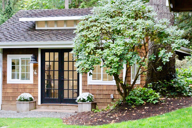
This post has been a long time coming.
I am so excited to share with you today our new office space for Thompson Design + Build!
When we started our new business, we were struggling to find the right space for our office. We really didn't have room in our home, so the only logical space we settled on was my studio which sits a few steps from our back door.
Unfortunately this space had seen better days. Because I used it for my studio, and a lot of that included woodworking, it was filled with sawdust, dirt, a paint splattered floor, and nicked walls.
It had also become the landing place for things we weren't using, things I needed to sell, etc.
You get the point, it was very cluttered and dirty!
We spent a couple months cleaning it out, giving it a fresh coat of paint, and finding the perfect furniture to suit our needs.
I sold and donated a lot of my craft supplies, and we re-worked the wood working tools into another shed.
Like I mentioned, the floor was a mess. I had spilled a quart of paint in there at one point, and it just needed to be redone.
We opted for LVP flooring which is waterproof, hides dirt well, and looks high end for a low price tag.
The built in cabinets got a fresh coat of Annie Sloan Pure White chalk paint, and the walls got pure white paint as well. It really brightened it up and made it look so fresh and clean, and bigger!
I added these handles to the cabinets for a more modern look with contrast.
Because there was so much white, we added contrast on the ceiling with these gorgeous wood planks.
This company is new to me and I really like the "accent wall in a box" they sell. You can order it in different colorways to match your style. We chose the light, medium, and dark grey color combination. The wood is also double sided. One side is smooth and the other is rough. We chose to showcase both sides on our ceiling.
Then to add to the rustic feel while highlighting the white, we chose this chandelier. I really love how it adds to the rustic look while still being modern.
In the corner of the room is my husbands work desk. But what we really wanted to highlight was our pretty table in the center of the room. This is where I work from my laptop, meet with clients, lay out blueprints, fabric and wallpaper samples, etc. I wanted this table to be a showstopper, and that it is!
I ordered it here, and when it arrived I was even more happy with my decision. The top has a high gloss finish and the legs are the perfect rustic grey wash. It's huge and serves its purpose perfectly! The brand is Four Hands and while they don't stock it anymore, they have many other great options in that brand, and they are having a huge early Black Friday sales happening!
The chairs are super comfy. We are really happy with the comfort level and quality for the price.
I knew from the beginning that I wanted our business name to be really bold. I wanted it to be the first thing you see when you walk in. I found this great company that makes letters and numbers that protrude out from the wall a bit. You can choose from a variety of fonts and sizes. We chose the 7" letters to fit our wall. The font we used is called Trajan Pro.
I love how it turned out.
And for the walls we turned to Mpix to create some great canvas'
We chose our dogs to be our art and I really love how they look. You can save 25% off your first order when you sign up for their emails.
Of course I have a little coffee station out there because I can't live without my coffee.
It sits on top of a large filing cabinet that our neighbors gave to us when they moved.
To keep us warm and toasty we installed this heating unit.
It has become such a fun and warm space, I sometimes just hang out in there, even when I am not working!
I hope you enjoyed this little glimpse into our office space.
xoxo
from
http://www.mysweetsavannahblog.com/2018/11/our-new-office-space.html


No comments:
Post a Comment