The last few months we have been busy flipping our first house!
We are about a day or two away from being done and then this puppy will go on the market. It is minutes from Microsoft, has a community pool, and is ready for a family or a single professional.
This home was in really rough shape when it came into our hands. An elderly gentleman had lived there since the 60's. Layers and layers of tape on every window, mold, rust, mildew, you name it, a total gut job.
I am doing this post in a few stages. Today I will be sharing the before and afters of the master bedroom and bathroom.
Lets start with the master before:
Don't say I didn't warn you.
These pictures show the entire master bedroom, bathroom, and what will be the closet area.
We had to get creative with configuring the new bathroom and closet walls.
I personally took out that shower but I made my husband do that toilet.
Not sure what happened to half that sheet rock.
Basically we took the left half in the picture above and created a small master bathroom with a separate water closet. There's a small hallway in the center with a floor to ceiling mirror, and on the right is a walk in closet.
What we created out of this space is a great big closet and a great big shower. What we didn't get is double sinks. There just wasn't room. You win some, you lose some.
We used this great modern barn door to close it all off from the bedroom and added an occupancy switch so you don't need to fumble in the night to turn the light on.
Of course I didn't get a good picture of the door, but trust me, it's so good!
I will be going back and taking pictures of everything I missed, but for now, these will have to do.
And here is the after:
We went with a more modern sleek look. Again, with Microsoft being minutes away, and this house being small, we catered towards a young professional.
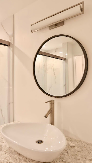
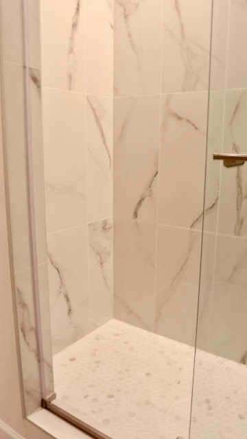
Grey tile floors, marble shower with glass door, and a sleek shiny grey vanity with a vessel sink.
Because this is a flip we didn't splurge anywhere. We had an entire house to overhaul mind you. I was very careful in picking out great looking finishes and accents, without breaking the bank.
The neutrals will appeal to a range of buyers hopefully.
I love this lighting! I actually used it in the upstairs bath as well.
The room also has ceiling light, but this casts a really warm glow.
The mirror was another inexpensive find.
I was dealing with a pretty tight space, and round seemed to be the answer here.
The water closet has a pocket door for privacy.
To get the high end look on a budget, we saved the marble for the shower floor in a hexagon shape, but opted for marble look porcelain tile on the walls.
Installing it vertically adds to the modern feel.
I wish I could've got a better picture, but it's a tight space.
Now, the master bedroom itself. This is the view when you are standing in the bathroom looking out. Before of course.
The popcorn ceiling went away, and we added pot lighting.
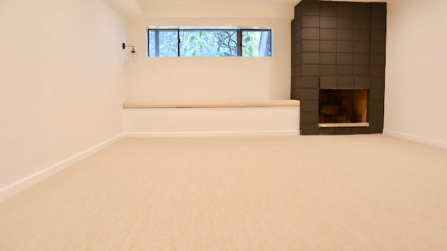
Instead of refacing the fireplace, I simply painted it with Sherwin Williams Urbane Bronze.
I felt like that space under the window was screaming for a window seat, so I had my husband build one. Our electrician added a cute sconce and I had a custom window cushion made here.
Melissa made our Roman Shades in our kitchen so I knew her work and trusted ordering it from her online. It's 10' long, massive, but I can picture it piled high with pillows, and a cozy little spot for reading with a fire going.
Plush neutral carpet and fresh white paint brighten up this dark room.
Can you believe it's the same space?
After getting this light I realized the gold really needed to be brushed nickel, so I spray painted it to match the rest of the fixtures.
What do you think? I am so excited to share a few more spaces with you this week.
Check back tomorrow for the kitchen before and afters.
Thanks for following along.
xoxo
from
http://www.mysweetsavannahblog.com/2019/02/bellevue-flip-before-and-after.html


No comments:
Post a Comment