Here is the fabulous before photo!
I hope that didn't hurt your stomach.
This room you are looking at sits off the sink/vanity area. So when you walk in, you walk into the vanity hand washing area, and then beyond this door is the toilet and tub/shower. As you can see, very rough.
I don't think I have a before picture of the vanity area. Basically it had really hideous drop down fluorescent lighting, an oddly placed medicine cabinet, and a wall to wall frameless mirror.
Bah-bye.
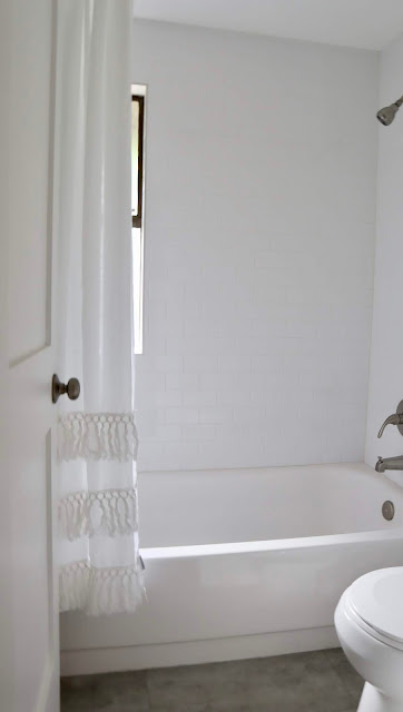
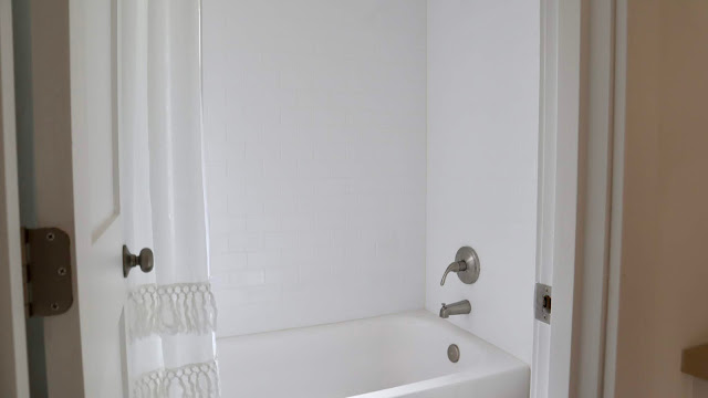
We were actually able to save the bathtub. A lot of elbow grease went into cleaning it up, but it saved us a lot of money and time to keep it. I removed all the old tile and in went fresh classic white subway tile. New LVT in a grey finish went in, a new toilet, new plumbing, and a fun shower curtain.
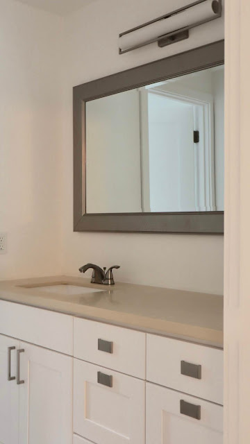
The front half of the bathroom got a new white vanity with brushed nickel pulls. I chose a rectangle sink because of the modern elements in the home. The light is the same one I used in the master bath.
I found the mirror at HomeGoods. It was the right size but the wrong finish, so once again, I got my spray paint out.
Quartz counters were added in here too, new drywall, basically everything.
xoxo
from
http://www.mysweetsavannahblog.com/2019/02/bellevue-flip-kids-bathroom-before-and.html


No comments:
Post a Comment